Post-jam update and discussion


Introduction and rambling
So, the dust has settled on the GMTK game jam for another year, and the results are out. At first, I was a little disappointed in the game's placing; roughly 1000th out of 7600, but now I've thought about it a little, I think I understand.
The core puzzle idea for this game was solid; I still believe that. It's a novel puzzle game in the style of many other games that are very successful, needing about the same amount of thought and strategy as sudoku or bridges, and with comparable difficulty. So why did it fail to resonate with many of the reviewers? While the rating period was going on, I almost started believing that it was really striking a chord with people: over 60 ratings with almost no advertising at all on my part (no posts in the Discord, and I didn't rate and comment on as many other games as usual) makes this the most popular-during-the-jam game I've ever made.
I still don't have a good explanation for this popularity. Perhaps it's the white-red-yellow colour formula which makes the cover image pop? In any case, there were a lot of comments, and very positive comments at that (but jam comments are, if anything, too nice!) One thing to draw from this, which I did notice at the time, is that several of the comments start with something to the tune of “it took a while to get the hang of, but once I did, I really liked it.” Remembering that the people who leave comments are, on balance, probably going to have spent more effort engaging with the game than the average reviewer, and that they still took a while to get the hang of the game, it seems like there’s a good chance that a lot of people gave up on the game before figuring out what was going on.
You should have no option but to have fun
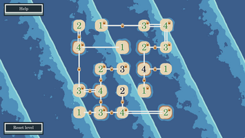
Say that you didn’t understand the game, and gave up with no idea what was going on; sure, it was explained in the help menu, but who reads annoying pop-ups anyway? Too many words. What impression are you left with? Only the first level: some shaders and sprites that I threw together in maybe one hour, tops, which can be interacted way in some ways that didn’t make sense and weren’t even that well juiced. Even worse, it doesn’t fit the theme at all! (Because it only fits the theme via the transitions between the levels, which is a bit tenuous at best. Get stuck on the first level and there’s no indication that it has anything to do with the theme.)
Compare this to one of the standard tropes in this jam: puzzle platformer where some element changes size. The game opens. Oh, it’s a platformer. Run, jump; what a smooth character controller! And things change size – that clearly leads to interesting level design – it fits the theme perfectly! Maybe ten seconds in, and that’s the impression, and, if done well, it’s a good one. It forces the player to have fun. A strange puzzle game: words, words, words, words, menus, more words, basic tutorial animations, yawn; why does it fit the theme? It certainly doesn’t in terms of mechanics. The puzzle does have depth to it, but you need to actively engage to have fun with it
Perhaps this is the message from the above two paragraphs: this game gives the player the option to enjoy the game, if they put some effort in, and push through an understanding barrier. A good jam game *forces* the player to have fun. I want to say that this is more pronounced in the bigger game jams, but I don’t have any evidence for this. (And a cynical part of my mind wonders if I’d have been better off not putting up a web build; the shaders would run more smoothly on a downloadable version, and there’d be a higher barrier of entry to playing the game, possibly restricting to people more likely to get over the barrier of understanding the game.) One thing that does seem abundantly clear though is that the quality of games submitted this year was incredibly high. Sure, I think my game is good, but I had twice as long as usual. So did everyone else. And it shows.
So, what to do about all this? This now segues into a discussion of how I spent my time during the jam, and how I would change it if trying again.
What went well?
I’ve done a few game jams by this point, mostly in the 2-to-3-day range; I think this was the longest jam I’ve gone into with the intention of working essentially flat-out for the whole duration (and I think about as long as flat out is sustainable for!) With this comes experience, and I’m now fairly confident in my skills using Godot and all the various peripheral programs that get pulled in to the jam. This all adds up to being able to accurately guess how long the core mechanics of a game will take for me to build out, and this was no exception; the game was basically playable by the end of Saturday, with a few remaining gameplay wrinkles smoothed out by the middle of Sunday. Generating the puzzles themselves was also far from easy but went without a major hitch. This then left the rest of the time for the part of this game that I was much more ambitious about: trying to make it look good.
What could have been improved?
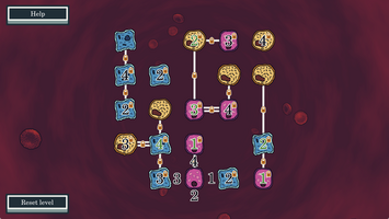
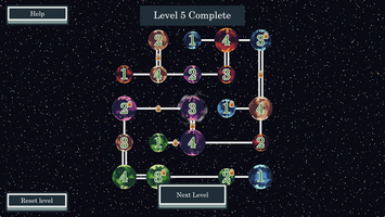
This was, I think, one of two key mistakes. The nature of the zooming in and out (which was necessary to fit the theme) meant, at least in the way I implemented it, that I essentially needed to make the graphics for three different games. It was even supposed to be four at the start, but a ‘town’ stage got left on the cutting room floor when it became clear how much of a pain the zoom was going to be to code. I managed to steal a lot of the shaders from things I’d made before, but needing three complete different visuals meant that my effort was spread too thin, and this was an excellent way of meaning that I couldn’t spend too much time getting any particular part looking excellent. It did all end up working out, but I think a lot of that time would have been better spent improving the tutorial and trying to solve the hard problem of getting players to understand the game as fast as possible.
All this focus meant that audio was of course shoved back into the last few hours (as it always ends up being… one day I’ll give audio design the respect it deserves), which I think I somewhat got away with thanks to finding some music that worked well enough at the last minute (One Man Symphony to the rescue!) and shamelessly copying in sound effects from previous games.
One other issue worth mentioning is that, as I originally used Godot 4.2.1 with multi-threading, the browser version of the game didn't run in some browsers. In particular, I'm not sure there was actually any way to play the game on an apple device. If I'd realised this was going to be such an issue I would have updated to 4.3. I've updated now, at least.
I said that there were two key mistakes, and the first was over-scoping the visuals. The second, as discussed earlier, was essentially that this just wasn’t a very good choice of game for this kind of jam, where people will only play for a little bit of time. And, once I had picked it, I should have put far more effort into making the introduction to the game as smooth as possible. I did a few playtests, but that was before the tutorial; I should have done more after the tutorial was put in.
The thinking behind making this kind of game was to “play to my strengths”: I’m relatively much better at technical, fiddly, maths-y coding than I am at polishing and making things look really good. Finding a game that strikes a balance between this and being a good jam game is something I’m still figuring out.
Conclusion and a bit more rambling
This was, all-in, and okay execution of a good idea for a game, but one which didn’t work so well as a jam game. I would have been better off spending less time on visuals and focusing my efforts on somehow both explaining the game and packing a punch as fast as possible.
With all that said, I’ve put out an update for the game that includes a few more, harder puzzles, and fixes a few of the easier-to-address issues that were raised during the jam, but little of substance has changed; I’m just much more motivated to build Grimoire towards a full game (and I have a lot of ideas for that) than I am to work on Archipelago at the moment.
Putting "rambling" in two section headings might give the misleading impression that there isn't rambling in all the other sections.
Hopefully that’s some lessons learnt – bring on the next jam!
Files
Get Archipelago
Archipelago
Sudoku crossed with Bridges... Or Bridges crossed with Sudoku?
| Status | Released |
| Author | TheJackOfClubs |
| Genre | Puzzle |
| Tags | 2D, Game Maker's Toolkit Jam, Godot, Indie, Relaxing, Short, Singleplayer |

Leave a comment
Log in with itch.io to leave a comment.